Liquid Glass in iOS 26: How Apple’s New Design Affects Mobile App Usability
Liquid Glass is the central visual change in iOS 26 and one of the most noticeable updates to the iPhone interface since the move away from skeuomorphic design in earlier iOS generations. It introduces translucent, reflective and context-aware surfaces across system areas, Apple apps and third-party interfaces that adopt the new design guidance. For mobile app users, this change is not only about appearance. It affects readability, navigation, touch clarity, visual hierarchy, accessibility and the way information competes for attention on smaller screens.
What Liquid Glass Changes in the iOS 26 Interface
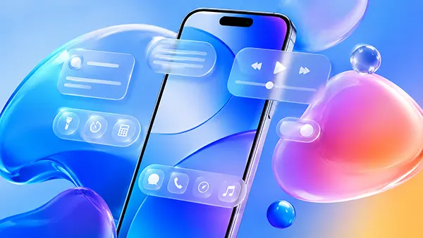
Liquid Glass changes the visual behaviour of interface elements by making buttons, navigation bars, controls, sheets and other surfaces appear more layered and responsive to the content behind them. Instead of relying only on flat colour blocks, iOS 26 uses glass-like materials that can show depth, blur, light response and subtle movement. This gives apps a more spatial feel, especially when the user scrolls through content or moves between screens.
The most important practical effect is the stronger separation between foreground controls and background content when the design is used carefully. A toolbar can feel lighter while still remaining visible, a menu can appear connected to the screen beneath it, and a floating control can look less intrusive. However, this also means that poor implementation can quickly reduce clarity. If a developer places translucent controls over complex imagery, dense text or high-contrast backgrounds, the user may need more effort to recognise what is interactive.
In iOS 26, Liquid Glass also supports Apple’s broader goal of making design more consistent across iPhone, iPad, Mac, Apple Watch, Apple TV and Vision Pro experiences. For mobile apps, this consistency can reduce the learning curve when users move between devices. A search field, tab bar or control group can feel familiar even when the device changes. Still, consistency does not remove the need for careful app-specific decisions, because a finance app, a health tracker and a photo editor all require different levels of visual restraint.
Why the New Visual Style Matters for Everyday App Use
The first usability benefit of Liquid Glass is faster recognition of interface layers. When users open an app, they need to understand what is content, what is navigation and what is action. A well-designed Liquid Glass surface can help by creating a visible layer above the content without making the screen feel crowded. This is useful in apps with maps, images, video previews, dashboards or live content, where fixed opaque panels can hide too much information.
The second benefit is a more fluid sense of movement. As controls react to context and sit visually above content, transitions can feel smoother and less abrupt. This can make common actions such as opening a menu, switching tabs, expanding a sheet or returning to the previous view feel more natural. Good motion design supports orientation because the user sees where an element came from and where it goes next.
The risk is that visual richness can become visual noise. Mobile screens already have limited space, and users often interact with apps while walking, commuting, multitasking or checking information quickly. If Liquid Glass is used too heavily, the interface may look polished but become harder to read at a glance. The strongest app designs in iOS 26 are likely to be those that use the new material selectively, especially around navigation and key controls, rather than applying it everywhere.
How Liquid Glass Influences Readability, Navigation and Touch Clarity
Readability is one of the main areas affected by Liquid Glass. Translucent materials can improve depth, but they also depend heavily on contrast. Text placed over a glass-like surface must remain readable against changing backgrounds, including photos, wallpapers, maps, videos and dark or bright content. Developers need to test real screens rather than only clean mock-ups, because the same control may look clear on a simple background and weak on a busy one.
Navigation also changes because iOS 26 encourages interface elements that feel lighter and more connected to the content area. A tab bar can appear less like a fixed block and more like a floating control. A sheet can feel closer to the current task instead of looking like a separate screen. This can make app flows feel smoother, but only if labels, icons and selected states remain obvious. Users should never have to guess which tab is active or where the main action is located.
Touch clarity is equally important. A beautiful control still fails if users cannot immediately identify it as tappable. Liquid Glass may soften visual boundaries, so designers must pay close attention to shape, spacing, hit areas and feedback states. Buttons should not blend into the background, destructive actions should remain clearly separated, and primary actions should still stand out. The best use of Liquid Glass supports touch confidence rather than weakening it.
Accessibility Considerations for iOS 26 App Design
Accessibility is where Liquid Glass needs the most disciplined implementation. Users with low vision, light sensitivity, motion sensitivity or cognitive load concerns may find transparent and animated interfaces harder to process if contrast and movement are not controlled. Apps should respect iOS accessibility settings such as Reduce Transparency, Increase Contrast, Reduce Motion and larger text sizes. These settings are not optional extras; they are part of responsible mobile design.
Text scaling is especially important in content-heavy apps. When Dynamic Type is enabled, translucent navigation areas and cards must still have enough space to support larger labels without clipping or overlap. A design that looks balanced at default text size can become cramped when accessibility sizes are used. Developers should test Liquid Glass components with long labels, multiple languages and larger system fonts before release.
Another practical issue is focus and attention. Users need to know which element matters most on the screen. Glass effects, reflections and layered surfaces can draw attention even when they are not the priority. In apps used for banking, travel, health, productivity or messaging, clarity should come before decoration. Liquid Glass works best when it helps users complete a task with less friction, not when it competes with the task itself.
What App Developers Should Adapt for iOS 26
For developers, iOS 26 is not simply a visual refresh. It requires a review of layout, navigation structure, component hierarchy and accessibility behaviour. Apple’s guidance for Liquid Glass encourages developers to keep the most important content in focus and apply glass effects to custom interface elements with care. This means teams should not only update icons or navigation bars, but also reconsider how each screen guides the user from intent to action.
Custom components need particular attention. Many apps use bespoke buttons, cards, menus, media controls or dashboards that were created for earlier iOS design patterns. These elements may look outdated or visually heavy beside iOS 26 system components. At the same time, copying Liquid Glass too aggressively can create inconsistency or readability problems. The safer approach is to adopt native components where possible, then adjust custom elements only where they improve the user journey.
Performance should also be part of the redesign process. Materials that depend on blur, transparency and real-time visual effects can be more demanding than flat surfaces, particularly on older supported devices. Users judge usability not only by appearance, but also by speed, battery behaviour and responsiveness. If an app feels slower after a visual update, the design has failed in practical terms. Testing should include scrolling, transitions, long sessions and screens with media-rich content.
Practical Design Rules for Better Usability with Liquid Glass
The first rule is to protect contrast. Primary text, icons and action labels should remain readable against every likely background. Designers should test screens with light wallpapers, dark wallpapers, colourful images, video thumbnails and dense content. When in doubt, a more stable background treatment is better than a transparent effect that looks impressive only in ideal conditions.
The second rule is to keep interaction states unmistakable. Selected tabs, pressed buttons, disabled controls, alerts and destructive actions should be visually clear. Liquid Glass can make surfaces feel elegant, but it should not weaken the basic language of interaction. Users need immediate feedback when they tap, drag, select or dismiss something. This is especially important in apps where mistakes can cost time, money or personal data.
The third rule is to use the new design language with restraint. A small number of well-placed glass surfaces can make an app feel modern and coherent with iOS 26. Too many translucent layers can make the same app feel busy and tiring. The most successful mobile interfaces will treat Liquid Glass as a tool for structure, depth and focus, not as decoration for every available surface.